Your designer just sent you the final proof of your logo and you love it. You’re completely enamored. This is your brand. Your baby.
So naturally, you log into your computer, order some shirts for your employees, order new business cards, send it to your web guy or girl, and then update some social profiles.
But there’s something off. It looks great but it’s oddly shaped. Facebook fits it in the little square for the profile picture and there’s a lot of white space above and below. Instagram cuts off part in that circle. When printed on the pocket of a shirt, the words are too small to be legible, and when sent to that 5k you’re sponsoring, they’re only having the logos printed in grayscale. Not only is the color lost but it’s no longer recognizable as anything. What to do? Read on.
1. Does it work everywhere?
When designing your logo, try to think of all the places you might use it. Will it go on business cards, the web, and social profiles? Will it be printed on t-shirts or embroidered on more professional attire? How will the colors affect print costs? Will it ever be printed in just white?

It’s best to design your logo first in grayscale, that way you can be certain no elements get lost in another element. It makes the shape the focus of your logo and helps you make sure it can be easily recognized from a distance. If you used a designer and didn’t receive a grayscale version from them, ask for one.
2. Can it be updated and still remain consistent?
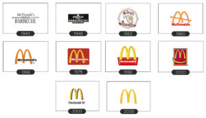
Are there certain elements of your logo that are essential to your brand and certain elements that are just stylistic? I hope so. This ensures that your logo can be updated with current design trends but still remain recognizable as it ages. Consider the golden arches. They’ve been around since 1962 and have gone through several changes. You may not even have realized these changes but McDonald’s has stayed relevant in regards to design without a complete overhaul. By making a simple shape the main thing, they were able to change the style around it yet still remain consistent.
3. Does it represent your brand or tell what your brand is about?
Many businesses think their brand is their name or service sometimes with a picture. This doesn’t have to be true. A logo can do two things – it can let a consumer know exactly what it is you do or it can evoke positive feelings that connect the user to your product. A mythological woman who calls sailors to their death on rocky shoals has nothing to do with coffee. A delicious fruit with an edible skin that sparked the ideas that led to Newtonian Physics has nothing to do with computers, phones, or EarPods.
But I already have a logo and it’s not great.
If your moving company is called “Here to There”, own it. Explain what you do, the services you offer, and build your brand around that logo and into something great.
If your moving company is called “Koala Bear Moving”, own that as well. Build in some character, give stuffed Koalas to the children of families that you move. People buy you and your products, not the picture on your shirt. I would never turn away a good company with wonderful reviews because they might show up with small marsupials printed on their shirts.
Whatever your name is, don’t get hung up here. Great logos are helpful but they’re nothing without great products, services, and great teams behind them.


